- Dashboard
- Widgets
- AI Diary
- AI Image
- Audio Editor
- Base64 / URL Encoder
- Canvas
- Collection
- Container
- Countdown Timer
- Currency Converter
- Daily Quiz
- Daily Quote
- Daily Riddle
- Date & Time
- Embed
- RSS Feed
- GitHub Releases
- Google Calendar
- Habit Tracker
- Hacker News
- Image Compression
- IP Info
- JSON Formatter
- Links
- Markdown Editor
- News
- News Summary
- Notes
- Podcast
- Pomodoro Timer
- QR Code Generator
- Quick Answer
- Quick Note
- Regex Tester
- Search
- Spacer
- Stopwatch
- Story Snippet
- Stripe Sales
- Subreddit
- Substack
- Tasks
- Text Diff
- Todo
- Translation
- Unit Converter
- Uptime Monitor
- Weather
- What If
- World Clock
- YouTube Channel
Widget Settings
Every widget has a settings panel where you can customize how it looks. Some widgets also have extra settings specific to what they do.
#Opening Widget Settings
- Turn on Edit Mode.
- Click the settings icon (gear) in the widget's toolbar at the top-right corner.
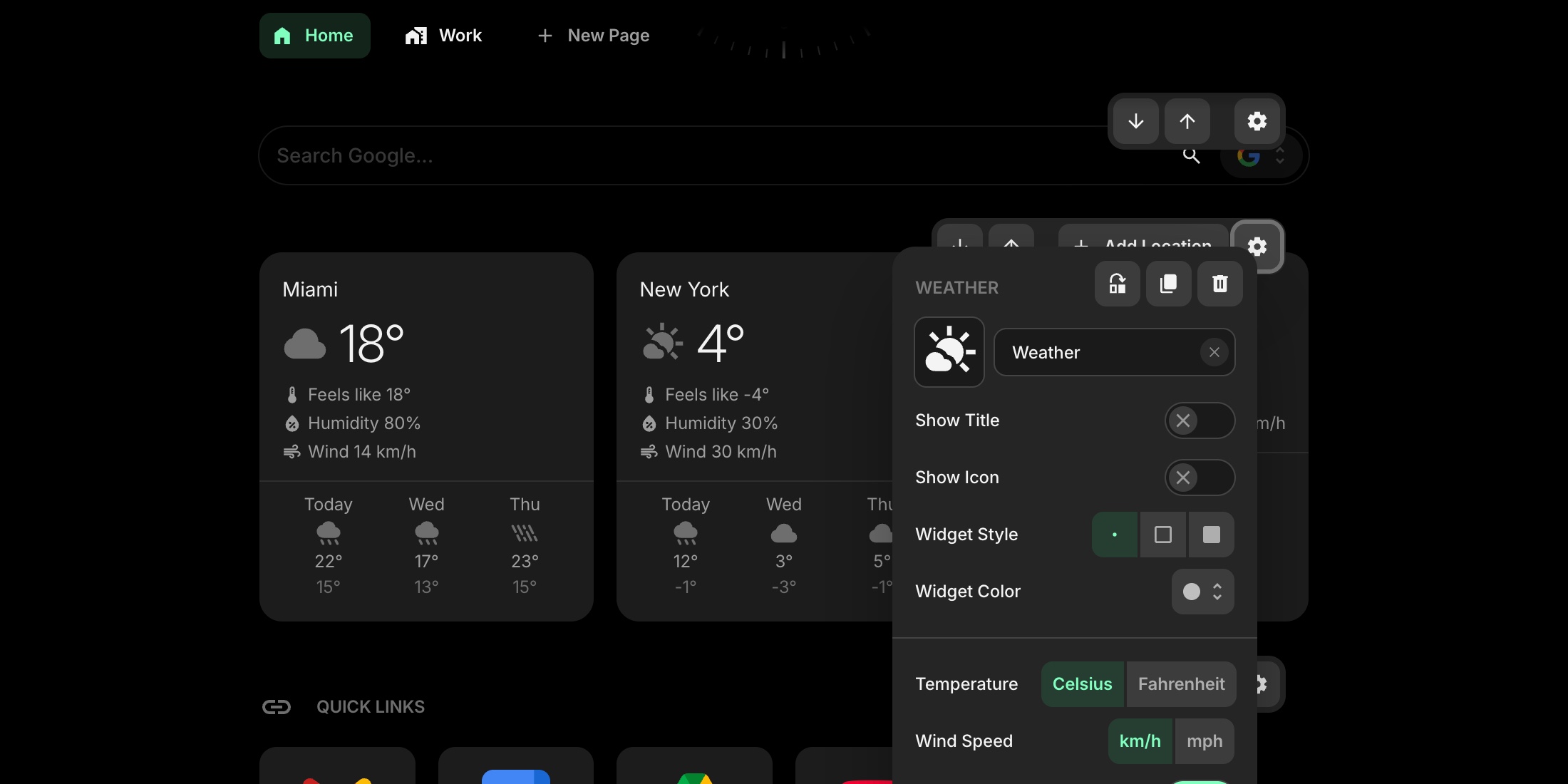
#Common Settings
These settings are available for every widget:
#Widget Title
Type a custom title for the widget. Click the clear button next to the input to remove it.
#Icon and Image
Pick an icon from the built-in icon library, or use a custom image URL. The icon or image appears next to the widget title.
#Show Title
Toggle whether the widget title is visible. Turned on by default.
#Show Icon
Toggle whether the widget icon is visible. Turned off by default.
#Widget Style
Choose how the widget card looks:
- Clear - no background or border, blends into the page
- Outline - subtle border with no background fill
- Solid - filled background card (default)
#Widget Color
Pick a color for the widget card. Choose from the same 10 colors available in Appearance settings: Default, Red, Pink, Purple, Blue, Cyan, Lime, Green, Yellow, and Orange.
#Widget-Specific Settings
Many widgets have additional settings below the common ones - for example, a Weather widget lets you choose temperature units, and a Links widget lets you control how links open. These are covered in each widget's own documentation page in the Widgets section.