- Dashboard
- Widgets
- AI Diary
- AI Image
- Audio Editor
- Base64 / URL Encoder
- Canvas
- Collection
- Container
- Countdown Timer
- Currency Converter
- Daily Quiz
- Daily Quote
- Daily Riddle
- Date & Time
- Embed
- RSS Feed
- GitHub Releases
- Google Calendar
- Habit Tracker
- Hacker News
- Image Compression
- IP Info
- JSON Formatter
- Links
- Markdown Editor
- News
- News Summary
- Notes
- Podcast
- Pomodoro Timer
- QR Code Generator
- Quick Answer
- Quick Note
- Regex Tester
- Search
- Spacer
- Stopwatch
- Story Snippet
- Stripe Sales
- Subreddit
- Substack
- Tasks
- Text Diff
- Todo
- Translation
- Unit Converter
- Uptime Monitor
- Weather
- What If
- World Clock
- YouTube Channel
Customizing Appearance
Make your dashboard feel like your own by adjusting its appearance. Click the palette icon in the top navigation bar to open the appearance settings.
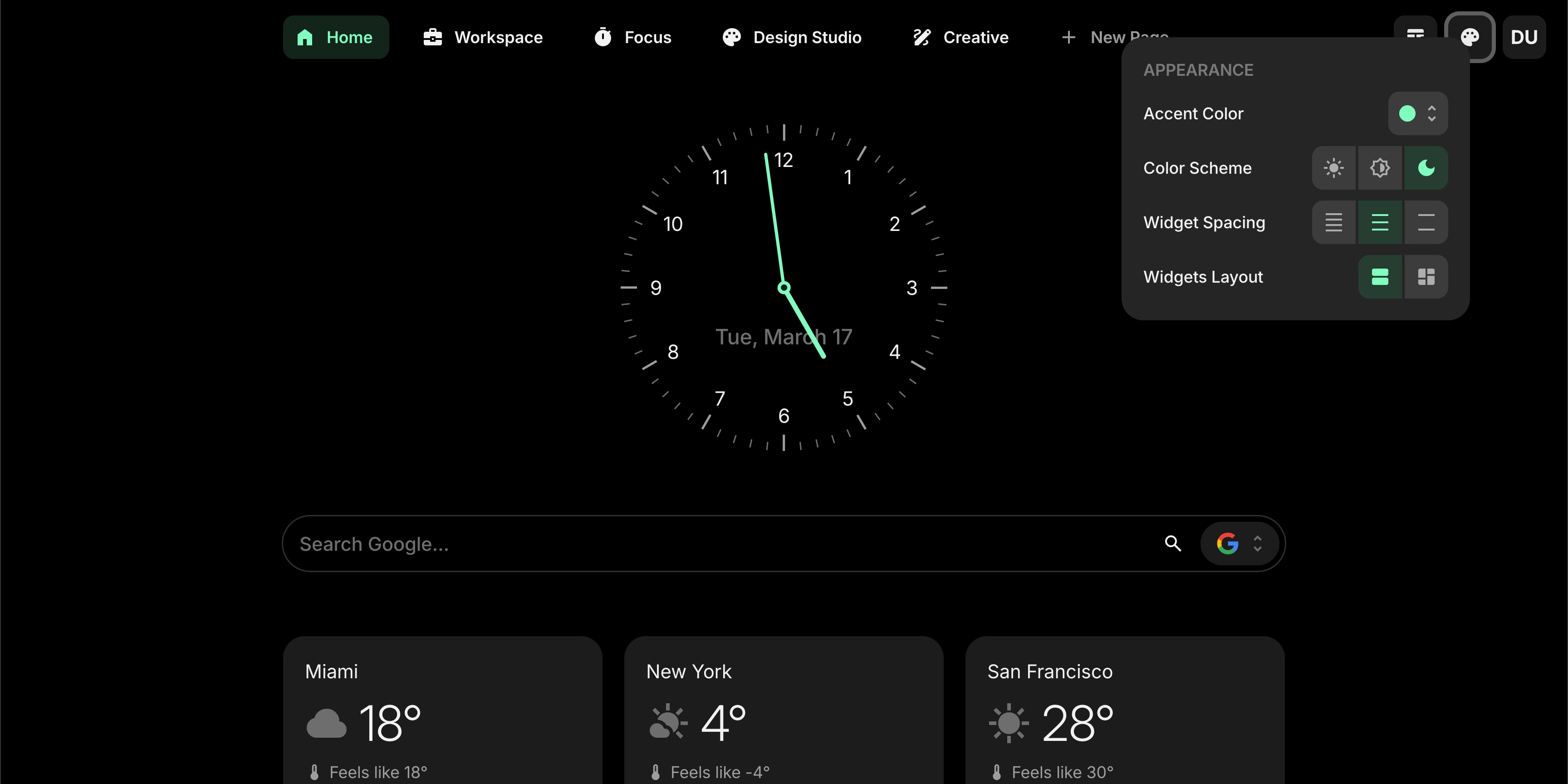
Appearance settings panel showing accent color, color scheme, widget spacing, and layout options
#Accent Color
The accent color is used for highlights, active tabs, buttons, and other interactive elements across your dashboard. Choose from 10 colors:
- Default (brand color)
- Red, Pink, Purple, Blue, Cyan, Lime, Green, Yellow, Orange
Click any color swatch to apply it instantly.
#Color Scheme
Pick the overall color scheme for your dashboard:
- Light - bright background with dark text
- Dim - a softer, muted dark theme
- Dark - full dark background
Your choice applies to the entire dashboard right away.
#Widget Spacing
Control how much space appears between widgets:
- Tight - minimal spacing between widgets
- Normal - balanced spacing (default)
- Loose - extra room between widgets
#Widgets Layout
Choose how widgets are arranged on the page:
- List - one widget per row, stacked vertically (default)
- Grid - two widgets side by side
The grid layout works on screens 640px and wider. On smaller screens, it automatically falls back to the list layout.