The Problem
What the current setup costs researchers every day.
- You follow forty sources - arXiv categories, journal RSS feeds, Substacks, three subreddits, a half-dozen academic blogs - and they live in five different reader apps, none of which you actually open daily. By the time you catch up, the conversation has moved on.
- You read a paper, mean to save the key passage, and end up with thirty browser tabs you cannot close because each one has a half-formed thought attached. The "tabs as memory" pattern collapses every time you restart the browser.
- Your reading list is a mix of Pocket saves, Raindrop bookmarks, browser favorites, a Notion database, and a Markdown file in Obsidian. You can never find the paper you remember reading because you cannot remember where you saved it.
- You want to ask a quick lookup question - "what year was that landmark study published" or "give me the gist of this method" - and end up in a thirty-minute Wikipedia and Google Scholar trip that derails the actual work.
- You collect inspiration sources visually - screenshots, figures, charts, archive site finds - and they end up in a screenshots folder you never open. There is no actual board where the visual leads live next to the text leads.
Widgets That Fit Researchers
A curated set, not a dump. Each one earns its place on the page.
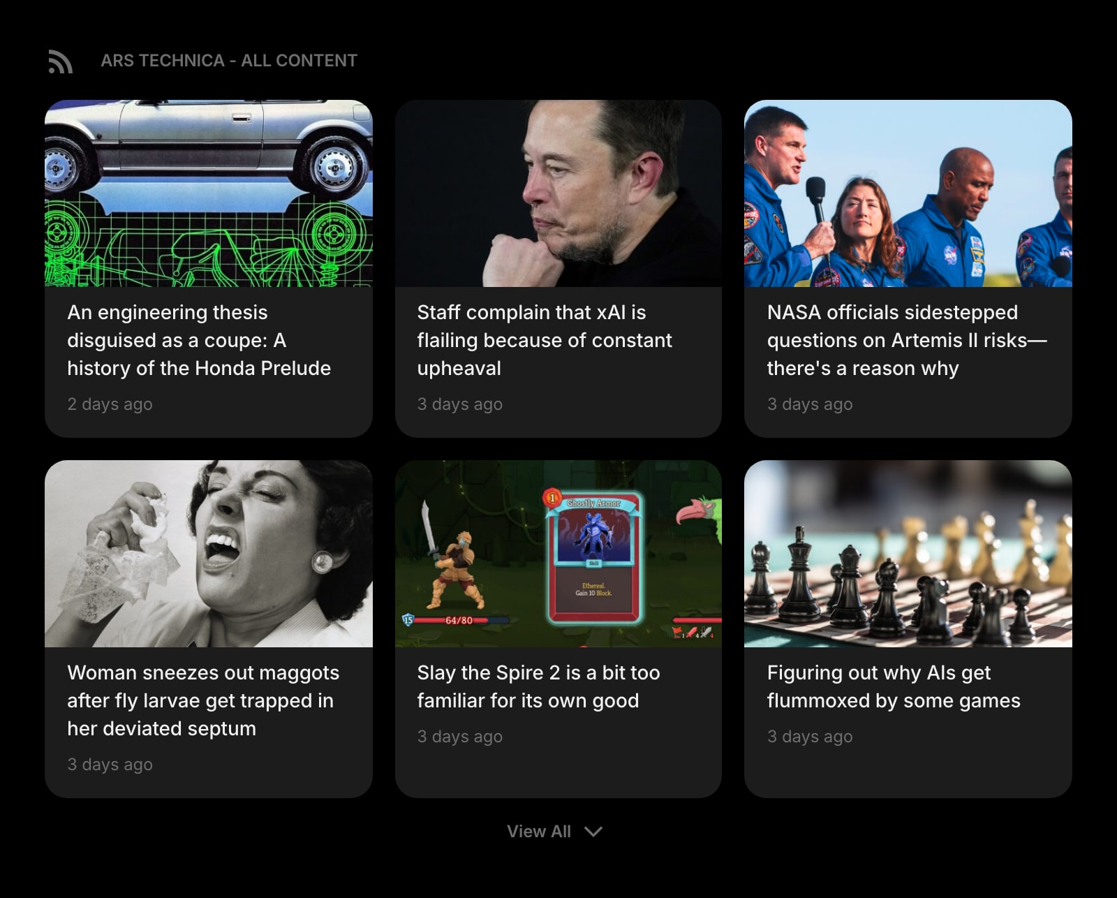
Feed (RSS)
Pull arXiv categories, Nature briefings, journal RSS feeds, and academic blogs into one column on the new tab. The reader you actually open every day because it is already there.
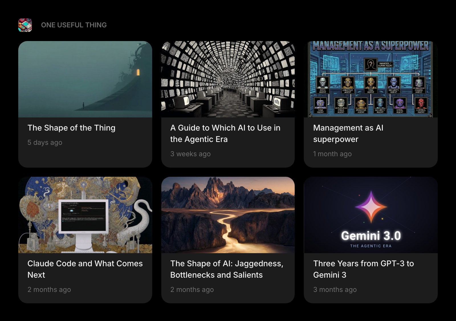
Substack
Every Substack you mean to read - the field newsletter, the methods explainer, the long-form essay author you follow - in one widget instead of fifteen unread tabs.
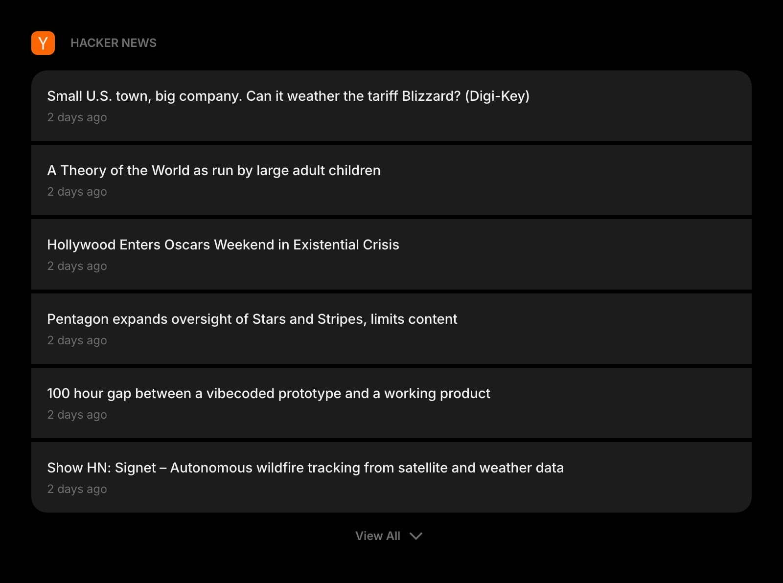
Hacker News
The HN front page on your dashboard. For tech-adjacent fields, the discussion threads under a paper post are sometimes more useful than the abstract.
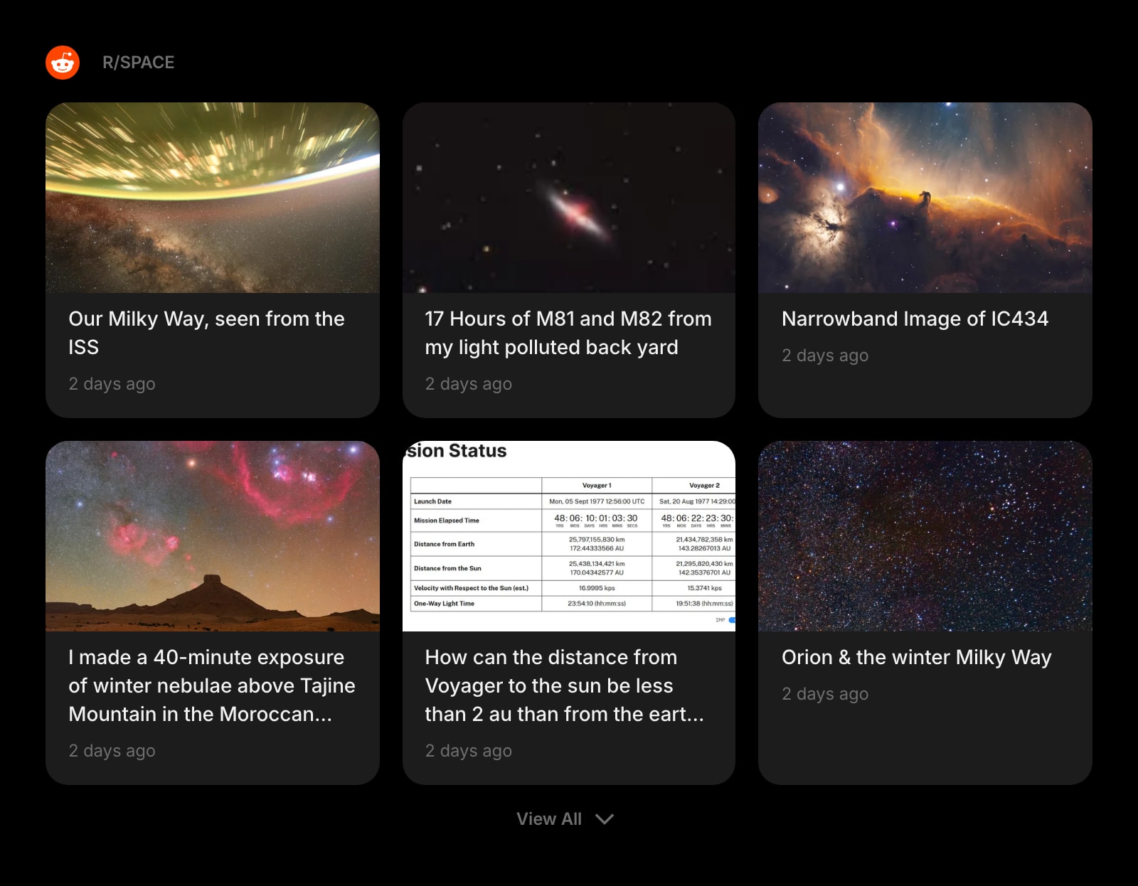
Subreddit
r/AskScience, r/MachineLearning, r/AskHistorians, the niche communities where domain experts actually argue. Read the threads that matter without giving Reddit a tab.
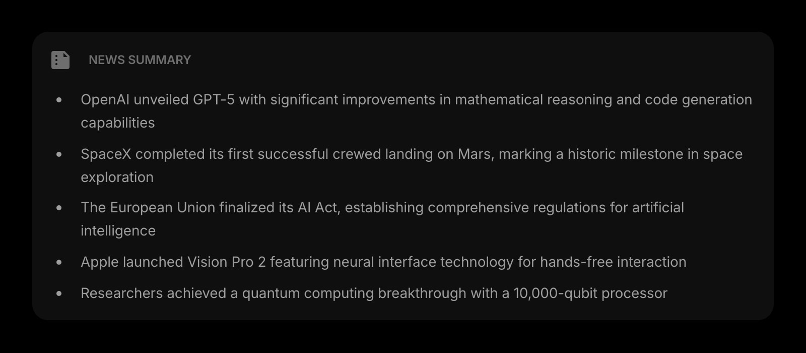
News Summary
A daily AI-written digest of the headlines in your space. A three-minute brief on what shipped, what was retracted, and what was funded - so the literature scan does not eat the morning.
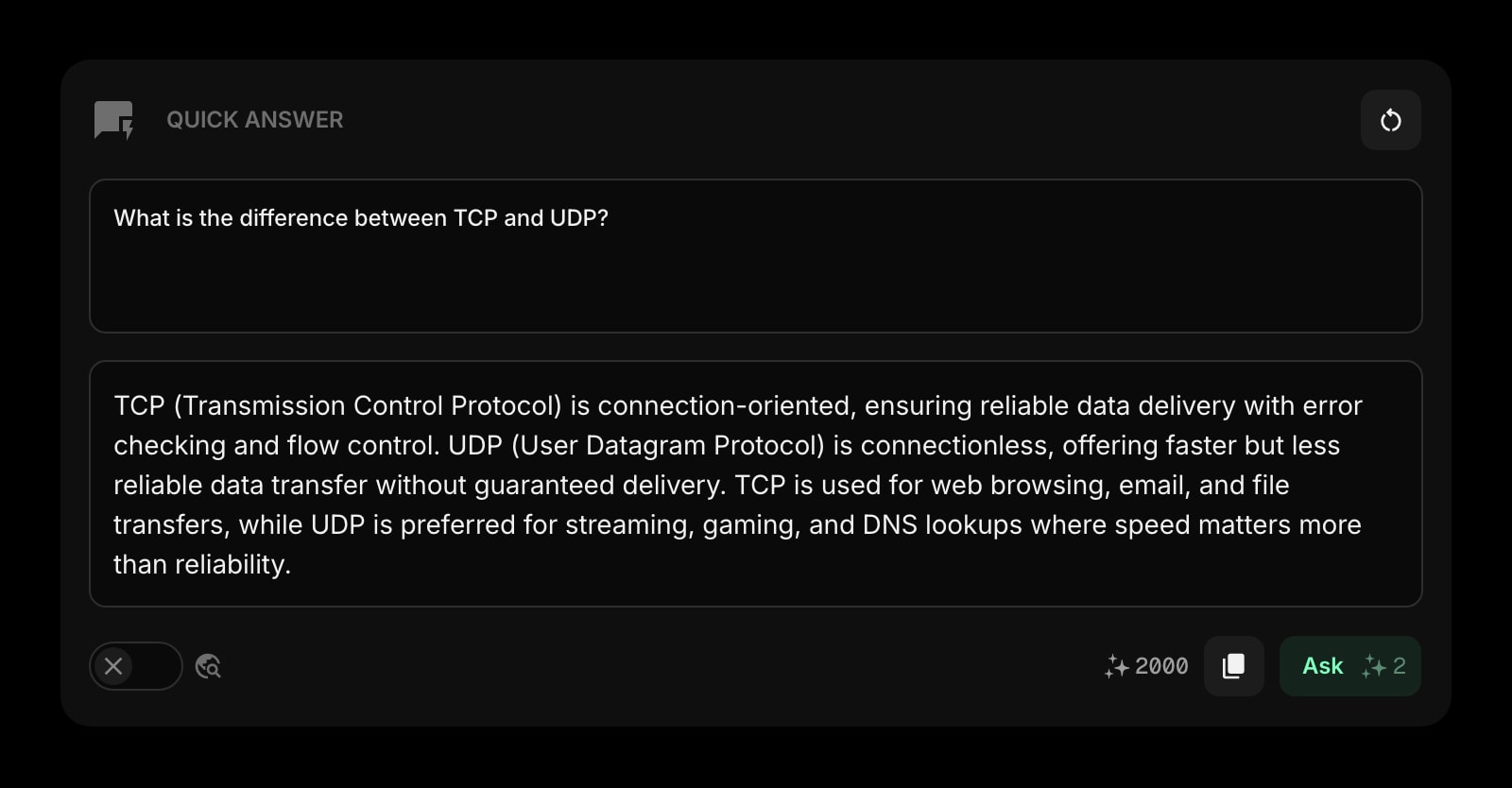
Quick Answer
Ask a quick AI question right on the new tab. "Summarize the abstract of this paper" or "what is the canonical citation for X" - answered in the same tab without spinning up ChatGPT.
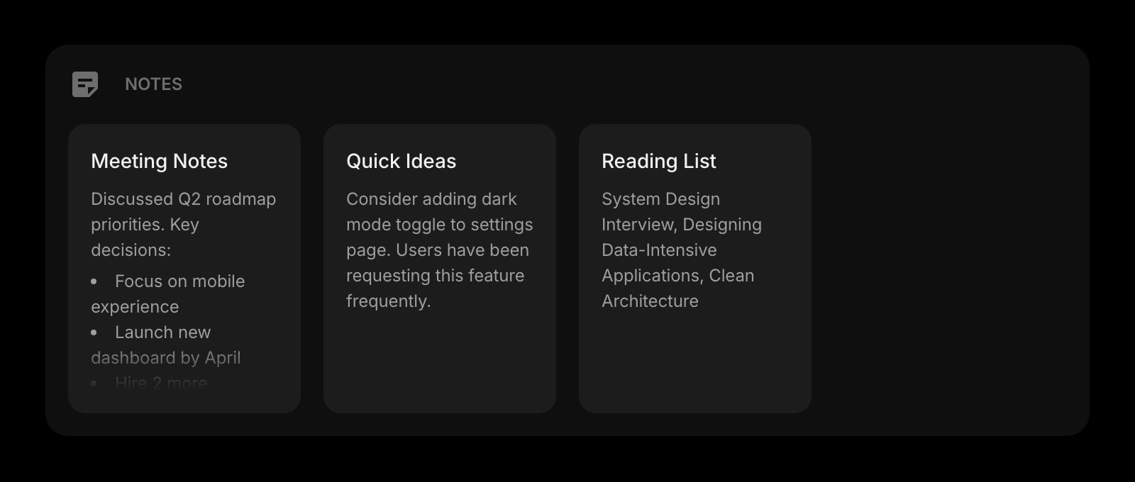
Notes
Rich text notes for your literature review draft, methods notes, and synthesis. Format with headings, lists, and links - same shortcuts you already use.
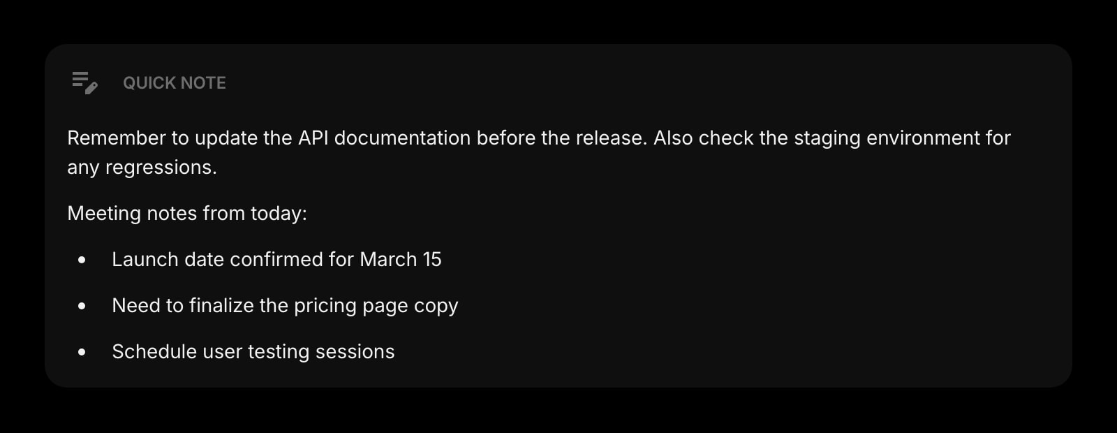
Quick Note
A scratchpad for the half-formed thought you do not want to lose while reading. Always there, no save button, no folder structure, no friction.
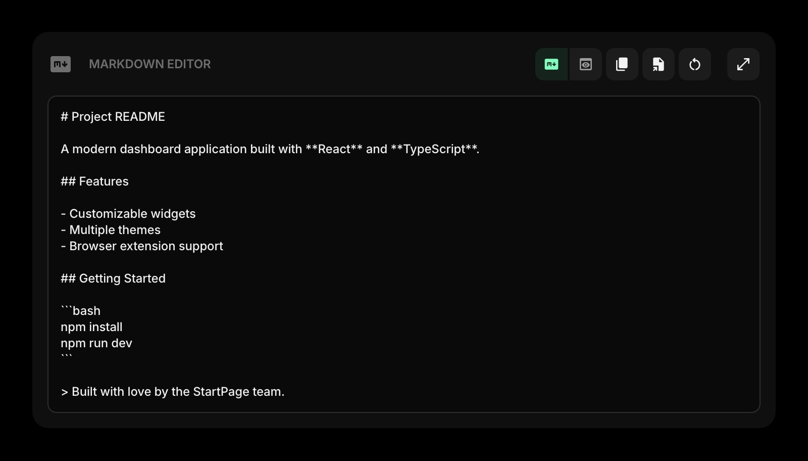
Markdown Editor
Draft a literature review section, a methods write-up, or a conference abstract with live preview. Paste into your manuscript or Obsidian when ready.
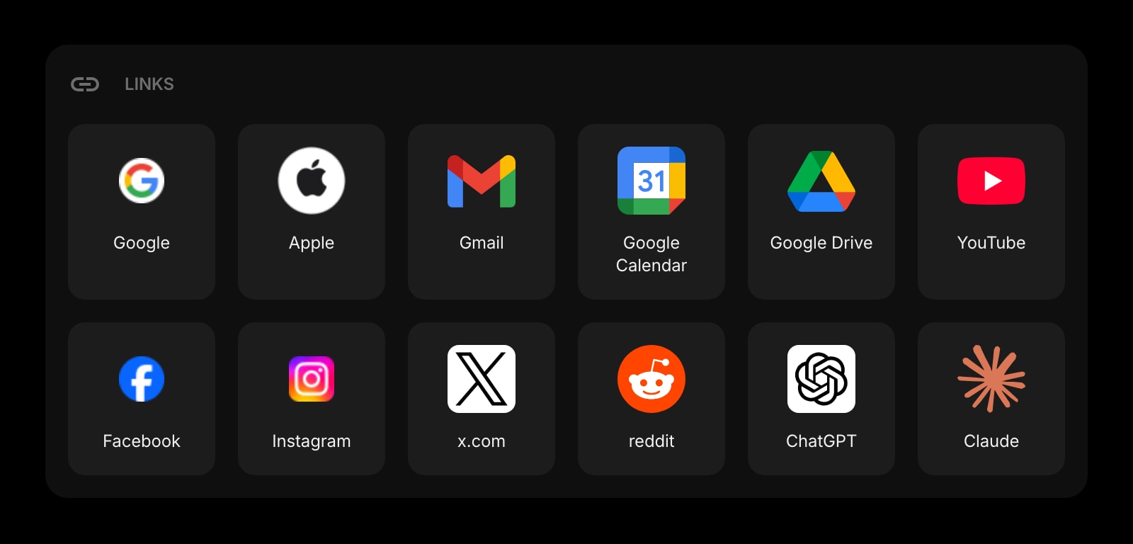
Links
Pinned shortcuts to Google Scholar, Semantic Scholar, your library proxy, your university VPN, the institutional repository. The bookmarks bar without the noise.
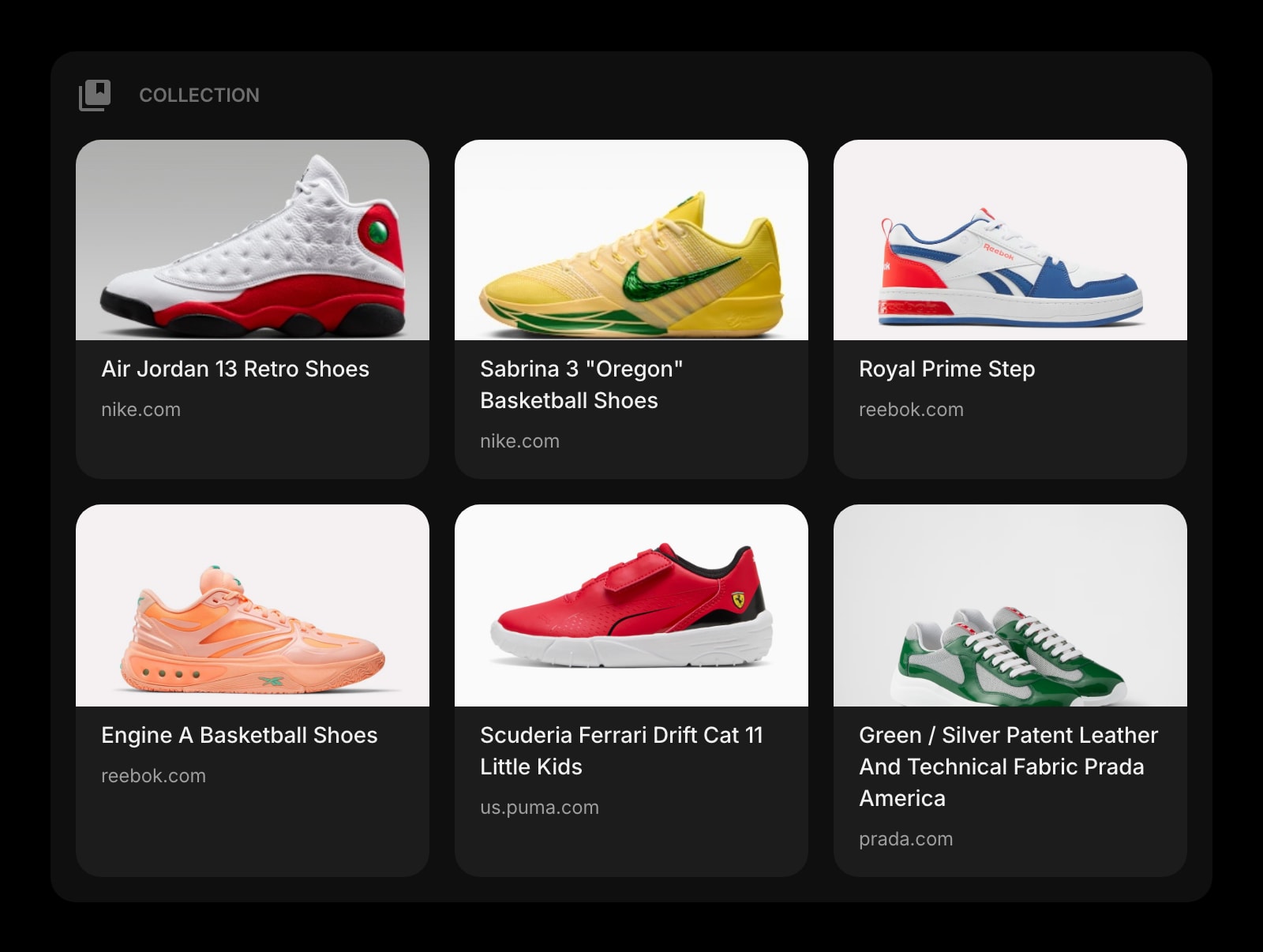
Collection
A Pinterest-style visual board for figures, screenshots from papers, archive finds, and visual references. Group by project and the visual leads live next to the text leads.
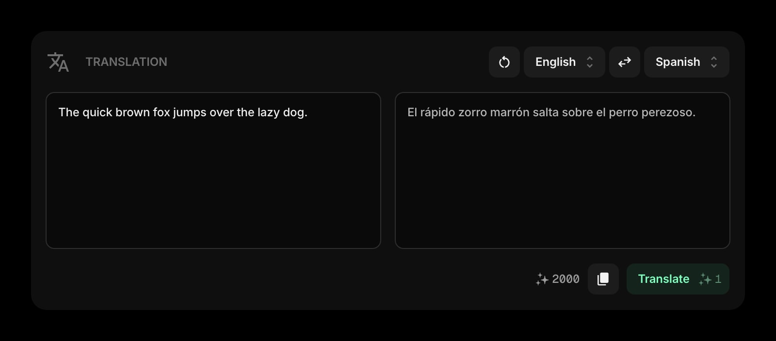
Translation
Drop a passage from a non-English paper and get a translation in place. For comparative or historical work where source material is not in your reading language, the friction drops to zero.
A Day in the Life
How Start Page HQ shows up across the moments that actually matter.
Morning Literature Scan
Open new tab. The Feed widget surfaced six new arXiv preprints overnight. The News Summary flagged a high-profile retraction in your subfield. You skim, save two papers to a Collection board, and the actual scan is done in twelve minutes instead of an hour-long Twitter spiral.
Mid-Reading Capture
You are deep in a paper PDF when an idea hits. Hit the new tab, drop the half-formed thought into Quick Note, and ask Quick Answer for the citation of a related study you half-remember. Back to the PDF before the train of thought derails.
Building A Source Collection
You are scoping a literature review on a new project. A dedicated page holds the Feed for that subfield, a Collection board for screenshots and figures, and a Notes widget for synthesis. Open the project page and the entire research context loads in one click.
Drafting At The End Of The Day
The morning's reading is captured, the Quick Notes are full of half-thoughts, the Collection board has six figures pinned. Open the Markdown Editor and pull it together into a methods section draft, then paste it into your Obsidian vault for the long-term home.
Why It Sticks for Researchers
Specific reasons it works for this audience - not generic productivity claims.
A Reader You Actually Open
Feedly and Inoreader sit in a tab you forget for weeks. The Feed widget lives on the new tab you open thirty times a day - it gets read because it is already in front of you, not because you remembered to click into a separate reader.
AI Quick Answer Without Leaving The Tab
Quick Answer turns the new tab into a lookup surface. Ask it for a definition, a citation, a method summary - get an answer without spinning up ChatGPT or losing the train of thought you were actually following.
A Visual Board For Visual Sources
The Collection widget is a Pinterest-style board for figures, screenshots, and archive finds. Most reader apps treat everything as a text headline; for fields where the figure is the finding, you finally get to see your sources.
A Page Per Project, Not One Stuffed Tab
A page for the dissertation chapter with its Feed, Collection, and Notes. A separate page for the side project with its own sources and drafting space. Switch with one click instead of fighting one overloaded layout.
Cheap Enough To Be Worth It On Day One
Every widget unlocked, sync across every device, AI credits included. $25 a year or $49 lifetime - cheaper than one month of most paid reader apps. Try the full thing free at startpagehq.com/demo before you decide.
Coming From Another Tool?
Already using a reader app and a notes vault for your research workflow? The widgets below cover the same jobs in the same tab. See how they map.
Frequently Asked Questions
No - and it should not. Obsidian and Notion are your long-term knowledge base; Start Page HQ is the day-to-day capture and reading surface. Most researchers keep deep notes in Obsidian or Notion and use Start Page HQ as the new tab where reading, capture, and quick drafts happen, with a Links widget pointing to the vault.
You can configure as many feeds as you want, group them across multiple Feed widgets, and split them across pages. The widget renders the most recent items per source on a schedule and pulls fresh content when you reload.
Quick Answer is a fast lookup AI - it gives you an answer in plain language. For citation-grade references, treat it as a starting point and verify in Google Scholar or your library before quoting in a manuscript. AI hallucination on citations is real.
The core layout, Notes, Quick Note, Markdown Editor, and Links work offline once the page is loaded. Feeds, news, AI Quick Answer, and Translation need a connection to refresh.
Page sharing is on the roadmap, not shipped. Most research teams today share an Obsidian vault or a Notion workspace as the team layer and use Start Page HQ as their personal reading and capture dashboard. Pasted Markdown drafts are easy to move between the two.
A free public demo at startpagehq.com/demo unlocks every widget for evaluation - no signup. Full access is $25 a year or $49 one-time (lifetime). Both unlock every widget, every page, sync across devices, and a pool of AI credits. No free tier on paid plans.