The Problem
What the current setup costs minimalists every day.
- Most "productivity dashboards" you have tried are sixteen widgets, three sidebars, four animations, and a banner. You wanted the time and a search bar, and you ended up with a panel of charts you never look at.
- Even the start pages that brand themselves as minimal still ship with a stock photo of a mountain, an inspirational quote, and a tracker for goals you did not set. The defaults are someone else's opinion of how your day should look.
- You actually like the new tab page. You open it forty times a day. The single most-opened tab in your routine is the place a productivity layer would have the most leverage - if anyone built one that did not assume you wanted a feature-fight.
- The minimalist tools you have tried each solve one piece. Momentum gives you the photo and the quote. Tabliss gives you a configurable clock. None of them give you the small set of widgets you actually want, in the layout you actually want, on every device.
- You do not want to spend a Sunday designing your own Notion dashboard. You want sensible defaults, the ability to remove what you do not need, and nothing else. Most apps treat blank space like a bug. You treat it like the point.
Widgets That Fit Minimalists
A curated set, not a dump. Each one earns its place on the page.
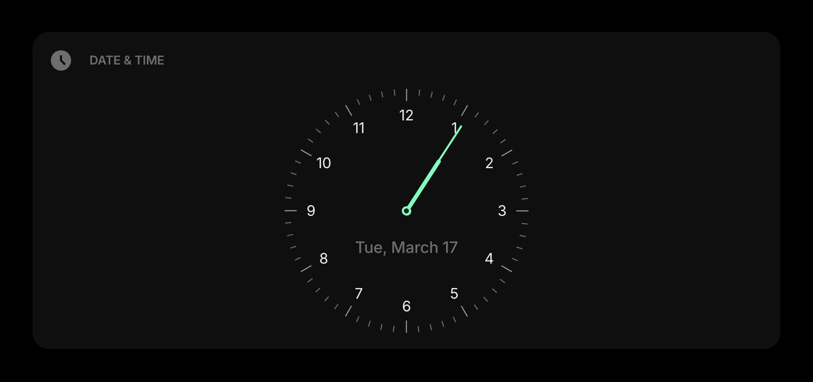
Date & Time
A clean, large-typography clock and date. Pick the format, pick whether to show seconds, pick the alignment - that is the entire configuration. The center of a deliberately quiet page.
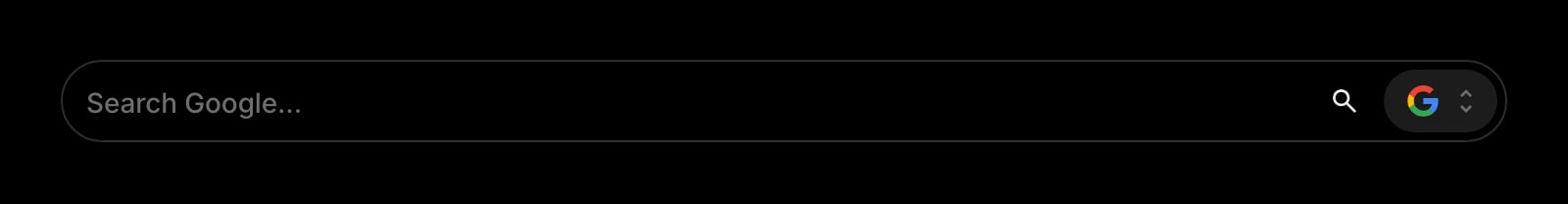
Search
A single search bar, with the engine of your choice. The most-used surface on a real new tab page, given the space and the focus the use deserves - no autocomplete clutter, no trending tiles below it.
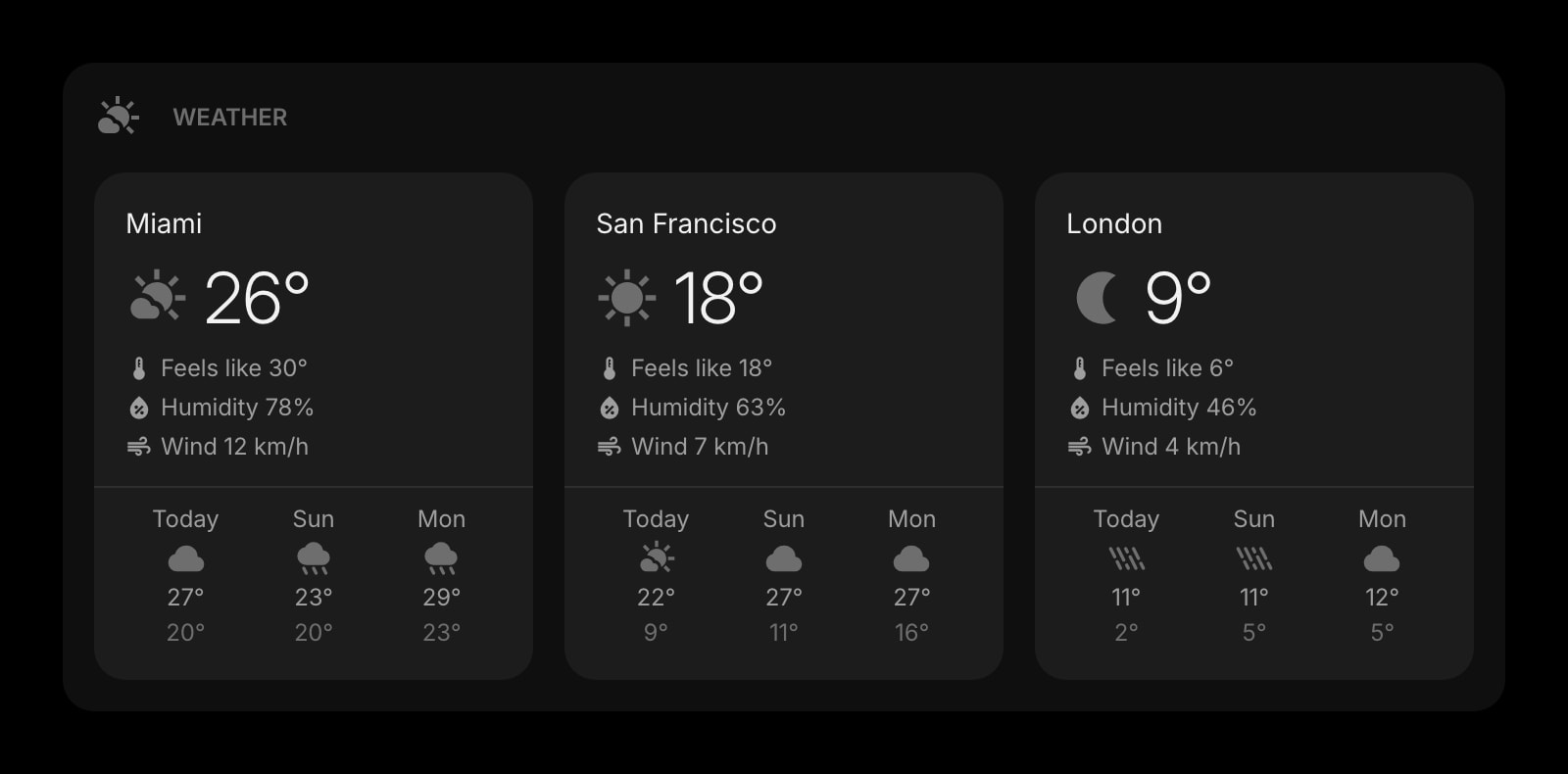
Weather
Today and the next few hours. One location, the temperature, the icon, the high and low - the smallest weather widget that still tells you whether to take a jacket. No radar, no advisories, no app open.
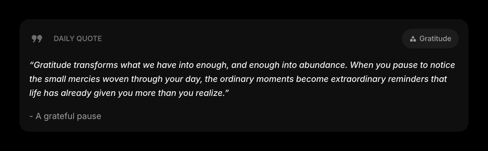
Daily Quote
A different quote each morning - if you want one. Off by default if you do not. Small, low-contrast, optional. The kind of touch that earns its place when it is not always there.
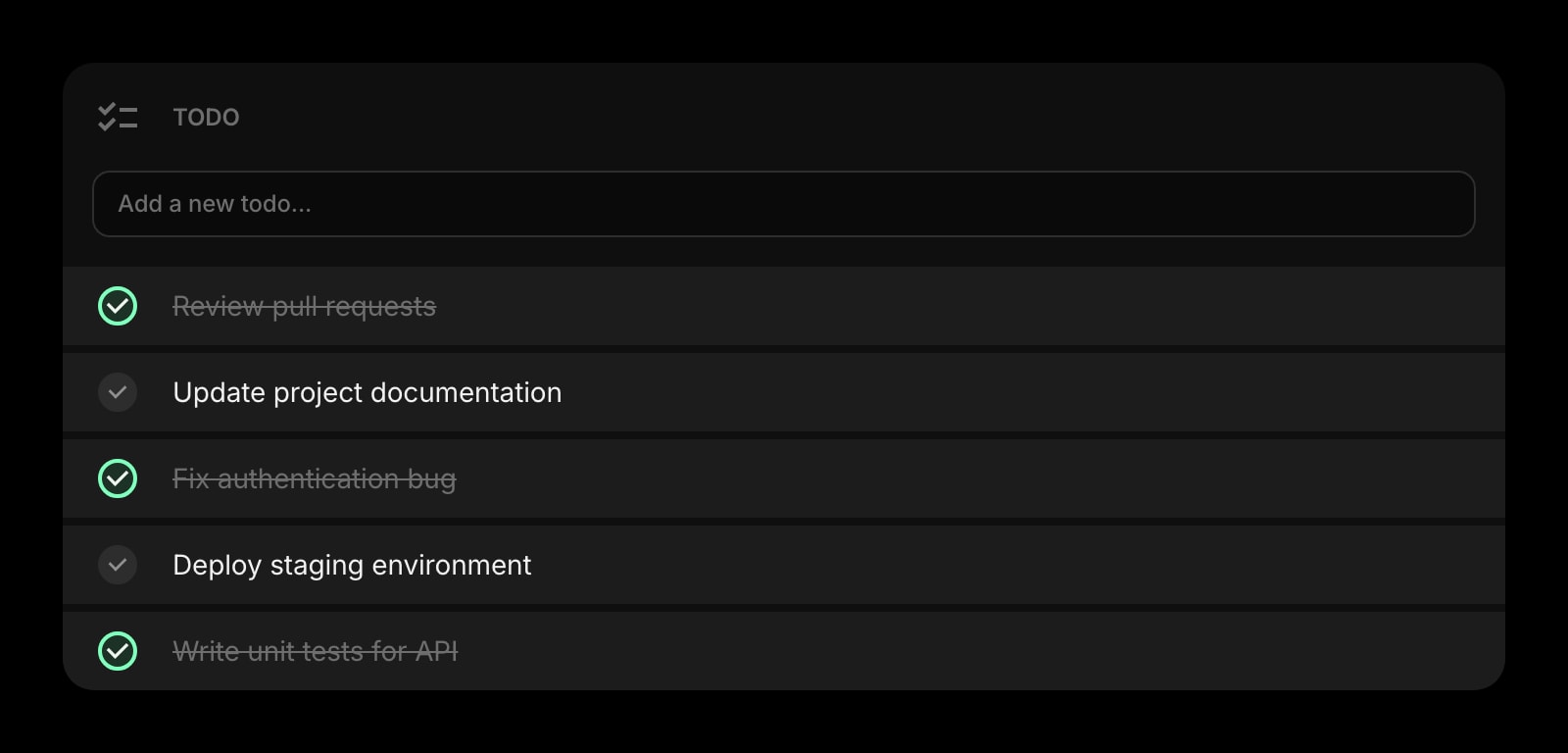
Todo
One short list - three to seven items - for today. Add an item, check it off, watch it disappear. No projects, no tags, no priority levels. The smallest todo widget that still does the job.
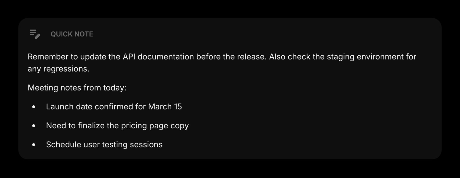
Quick Note
A single text area for the thought you do not want to lose. Always there, no save button, no folder structure, no formatting toolbar. The note you would have written on a sticky, kept where you can find it.
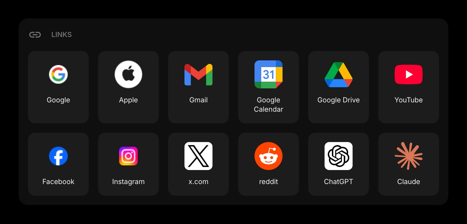
Links
Six or eight pinned shortcuts to the sites you actually open every day. Set them once, leave them alone. The bookmarks bar replaced by a quieter, more deliberate row.
Habit Tracker
One habit. The one you actually care about this season. A single row of squares, one tap to mark today done, an unobtrusive weekly progress badge as the only number on the page. Tracking, without the gamification overhead.
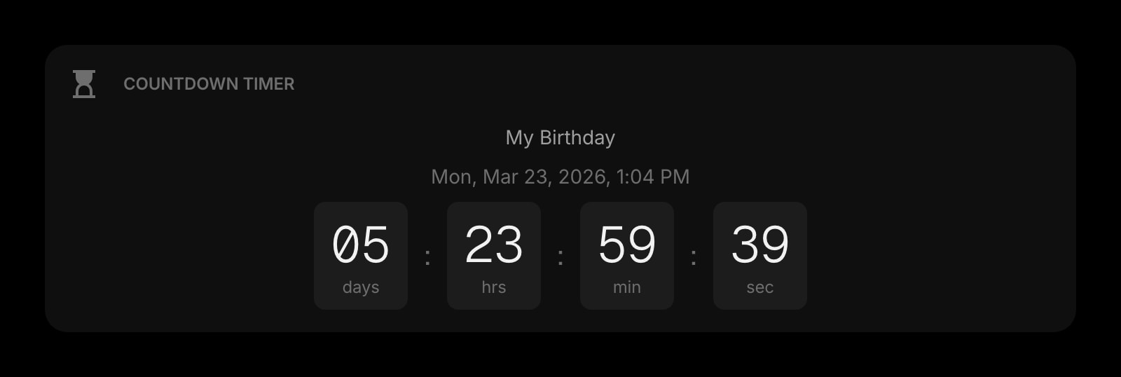
Countdown Timer
One countdown. The flight, the deadline, the move-out date. A single calm number on the page - a future fact you are walking toward, not a notification system that nags you.
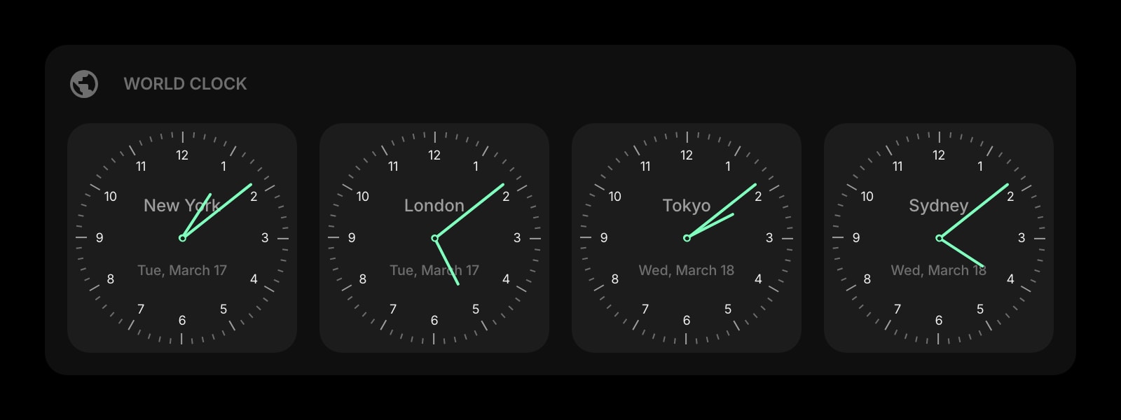
World Clock
One or two extra time zones if family lives elsewhere or you work with someone abroad. A small row beneath the main clock - present when it matters, invisible when it does not.
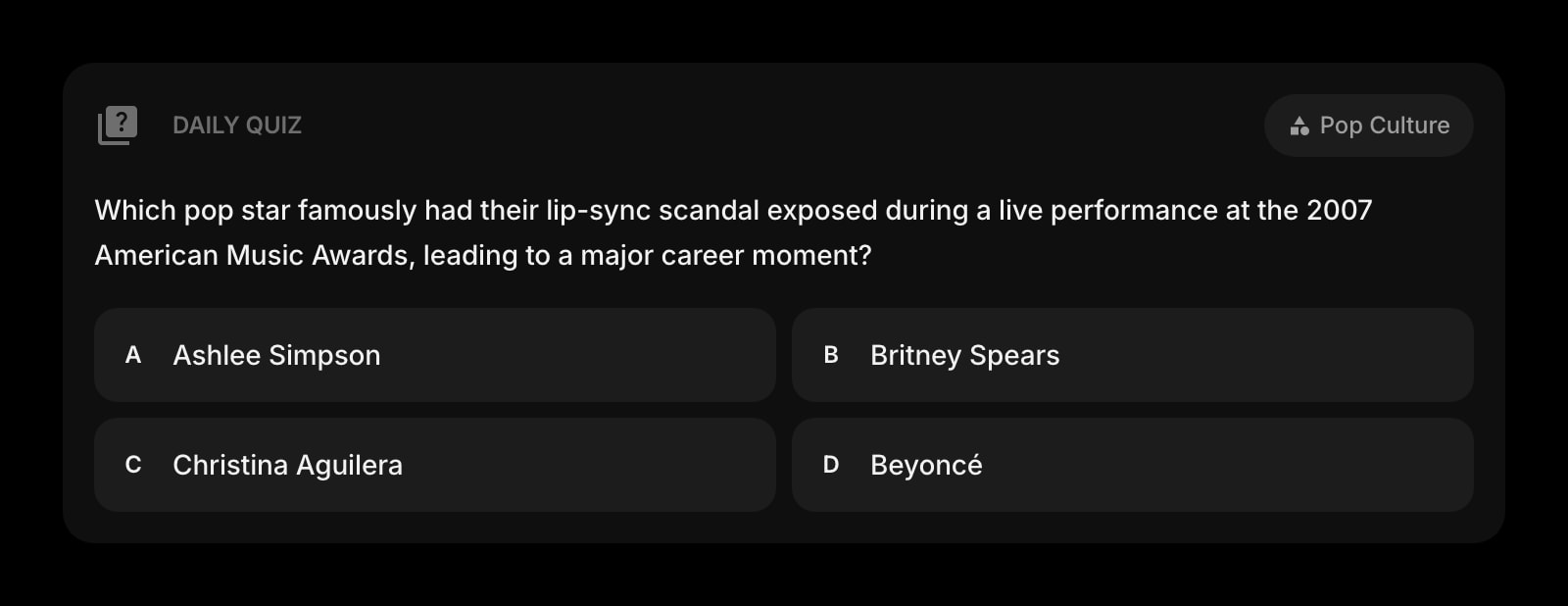
Daily Quiz
One question per day on a topic of your choice. A two-minute warm-up, hidden in a card you tap when you want it. The kind of small ritual that earns its space because it is once a day, not on a feed.
A Day in the Life
How Start Page HQ shows up across the moments that actually matter.
A First New Tab Of The Morning
Open the laptop. The clock fills the top of the page in big type. The Todo widget shows three items - the only three that matter today. The Weather is a number and an icon, the Daily Quote is a single line at the bottom. You read it, you close the tab, you go make coffee.
A Search That Is Just A Search
You need to look something up. You hit Cmd-T and the search bar is right there - centered, clean, no autocomplete suggestions, no trending stories beneath it. You type the query, hit return, and the loop is over in two seconds. The new tab page does not try to keep you on it.
Building Toward One Thing
You picked one habit for the season - meditate every morning, run three days a week, write before email. The Habit Tracker shows the streak as a single quiet row of squares. You tap today's, watch the count tick up, and that is the entire interaction. No coaching, no nudge, no streak-loss panic.
A Countdown Without Anxiety
There is one date that matters this month - a flight, a deadline, a kid's birthday. The Countdown Timer shows the number in a single card. You glance at it once a day, you do not get a push notification when it ticks down by an hour. Knowing is enough; reminding is too much.
Why It Sticks for Minimalists
Specific reasons it works for this audience - not generic productivity claims.
Empty Space Is A Feature
The Spacer widget is not a joke - it is the difference between a page that breathes and a page that fights you. You can leave half the grid empty on purpose. Most dashboards grow because their layouts assume more is better; here, the empty cell is the point.
Defaults That Subtract
Add a widget and it ships with the smallest sensible configuration. The clock defaults to time without seconds. The Todo widget shows no project list. The Weather widget shows one location. You add detail when you want it, not because the widget shipped with eleven things turned on.
A Page Per Mode, Not One Stuffed Layout
A page for "morning" with the clock, the weather, the todo. A separate page for "deep work" with just the search, a single Quick Note, and a Spacer where the other widgets would have been. Switch with one click - two layouts, both deliberately quiet.
Same Quiet Setup Everywhere
Sign in once and the layout, the chosen widgets, and their settings sync across every browser and device. The deliberate setup you tuned on the laptop is the same one that loads on the phone and the tablet. You do not have to re-design minimalism three times.
Cheap Enough Not To Need A Justification
Every widget unlocked, sync across every device, AI credits included. $25 a year or $49 lifetime - less than one nice notebook. Try it free at startpagehq.com/demo before paying; the demo is the same as the paid version, with no upsell shelf.
Coming From Another Tool?
Already running a minimal start page like Momentum, Tabliss, or Infinity New Tab and looking for something with the same restraint plus actual utility? See how they map.
Frequently Asked Questions
There is no minimum. Some users run just a clock, a search bar, and a Quick Note - and that is a complete dashboard. The grid happily lives mostly empty. Add the Spacer widget if you want to lock in a particular shape, or just leave cells unfilled.
Yes - they are widgets, not features. If you do not want a Daily Quote, do not add the widget. The same goes for everything else; the dashboard ships with whatever you add and nothing else.
You pick the theme - clean light, deep dark, monochrome - and the widgets render without their own decoration. There is no stock photo background, no animated weather, no panel chrome you have to hide.
Start Page HQ is a hosted web app, not a heavy extension. The new tab is a small page - a clock, a search, the few widgets you added. Most users see it open as fast as a default Chrome tab.
Yes. Open startpagehq.com on the phone, sign in, and your minimalist setup loads with mobile-friendly widget layouts. Most minimalists pair the laptop new tab with a separate phone-only page that holds even fewer widgets.
A free public demo at startpagehq.com/demo unlocks every widget for evaluation - no signup. Full access is $25 a year or $49 one-time (lifetime). Both unlock every widget, every page, sync across devices, and a pool of AI credits. No free tier on paid plans.