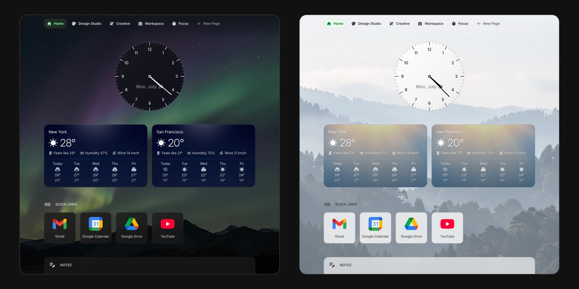
Wallpapers Are Here: 29 Backgrounds and Frosted Glass Widgets
Your dashboard has always been about what is on it: the widgets you check first, the links you open every morning, the notes you keep within reach. Now it can look like something too. Wallpapers put a background image behind the whole page, and every widget on top adapts to it automatically - frosted glass, softer outlines, a nav bar that blends into the image. Here is how it works.
#A Background Behind Your Whole Dashboard
Open the appearance settings from the palette icon in the top navigation bar and turn on Wallpaper. A grid of thumbnails appears right below the switch - click one and it applies instantly, no save button and no page reload.
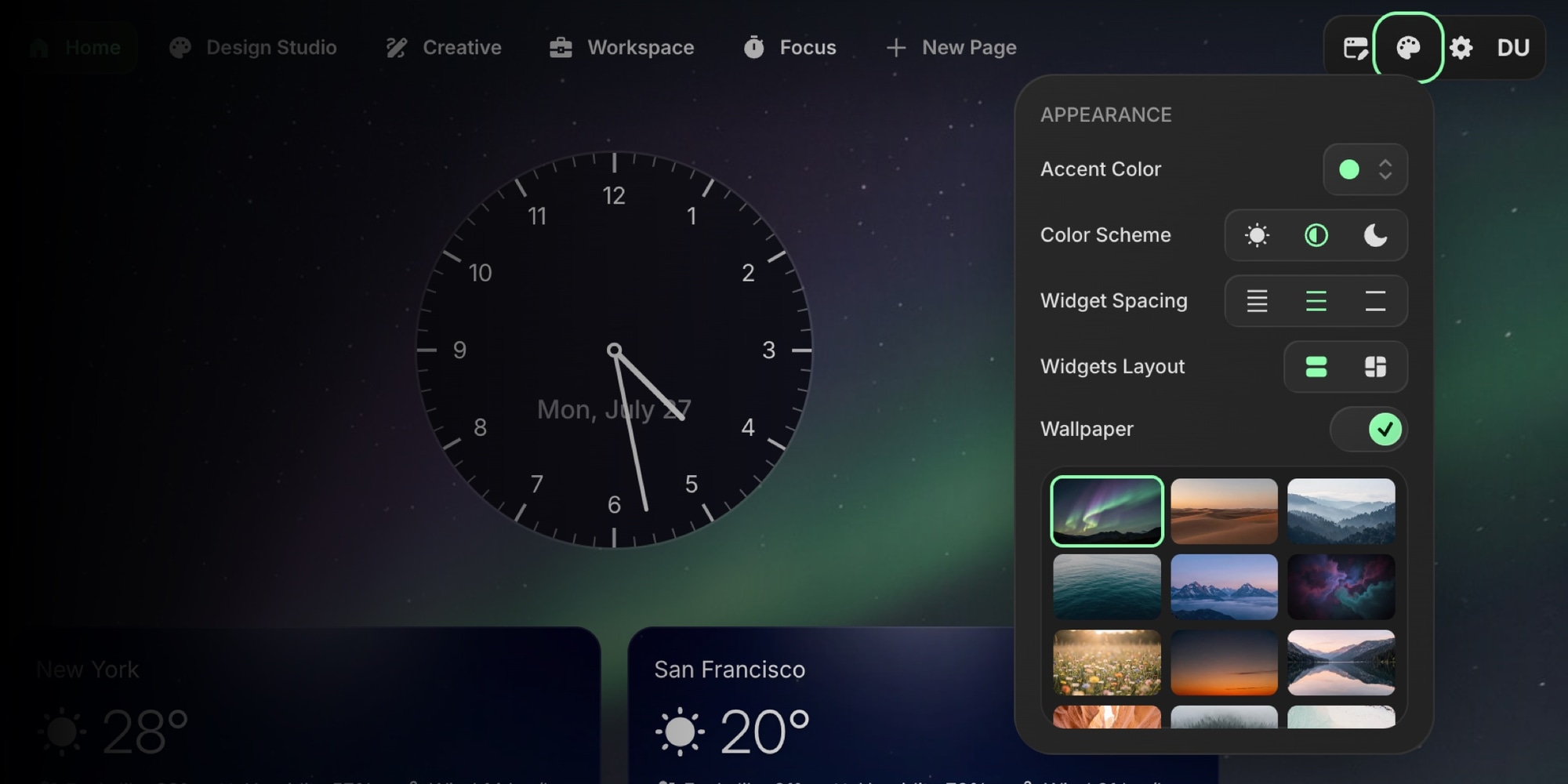
Wallpaper is off by default, so nothing about your current dashboard changes until you switch it on. Once it is on, the image sits behind everything: widgets, navigation, and all of your pages. Your Home, Workspace, and side project pages share the same background, so switching tabs feels like moving around one dashboard rather than five unrelated ones.
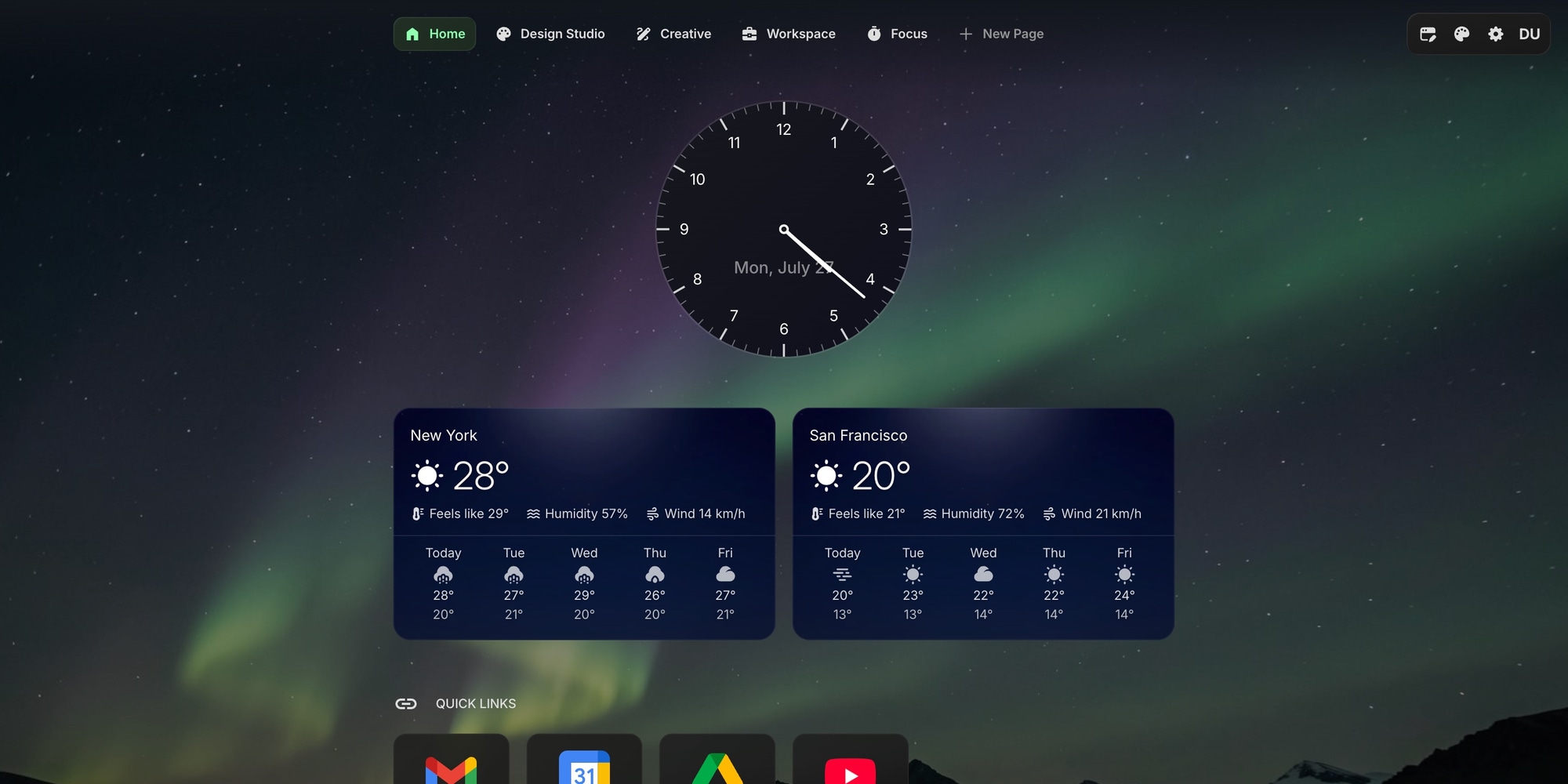
#29 Built-In Wallpapers
The picker ships with 29 backgrounds, split into two moods.
Scenic landscapes - 15 images for people who want a view: Aurora, Mist, Peaks, Glacier, Canyon, Shore, Pines, Dunes, Waves, Nebula, Meadow, Dusk, Lake, Storm, and Blossom.
Soft abstract gradients - 14 blurred, muted washes of color for people who want texture without a picture competing for attention: Ember, Haze, Drift, Bloom, Tide, Silk, Flare, Shade, Mint, Lilac, Lagoon, Onyx, Plum, and Abyss.
Every one was made for the same balance: enough interest to be worth looking at, calm enough to read your widgets over.
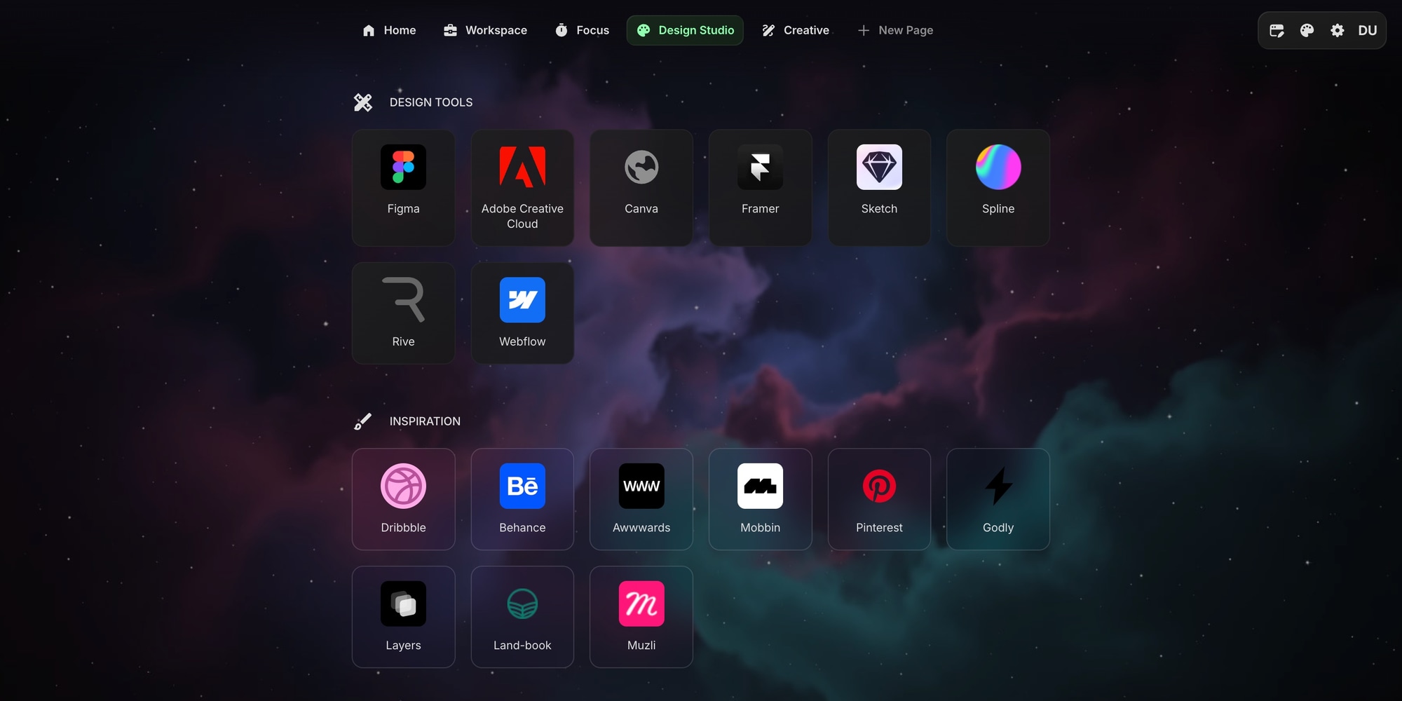
#Widgets Turn to Frosted Glass
This is the part that took the longest to get right. A background image is easy; a background image that does not ruin the readability of everything on top of it is not.
So widgets react to the wallpaper on their own:
- Solid and outline widgets pick up a backdrop blur and a slightly see-through fill, so the image glows through without the text losing contrast.
- Clear widgets paint no background of their own, which means their items sit directly on the wallpaper - those items become the frosted surface instead.
- Outlines and list separators switch to softer, accent-tinted variants. Hard grey borders look wrong over a photo.
- A scrim sits between the image and your content, dark over dark themes and light over light ones, keeping contrast steady no matter which wallpaper you choose.
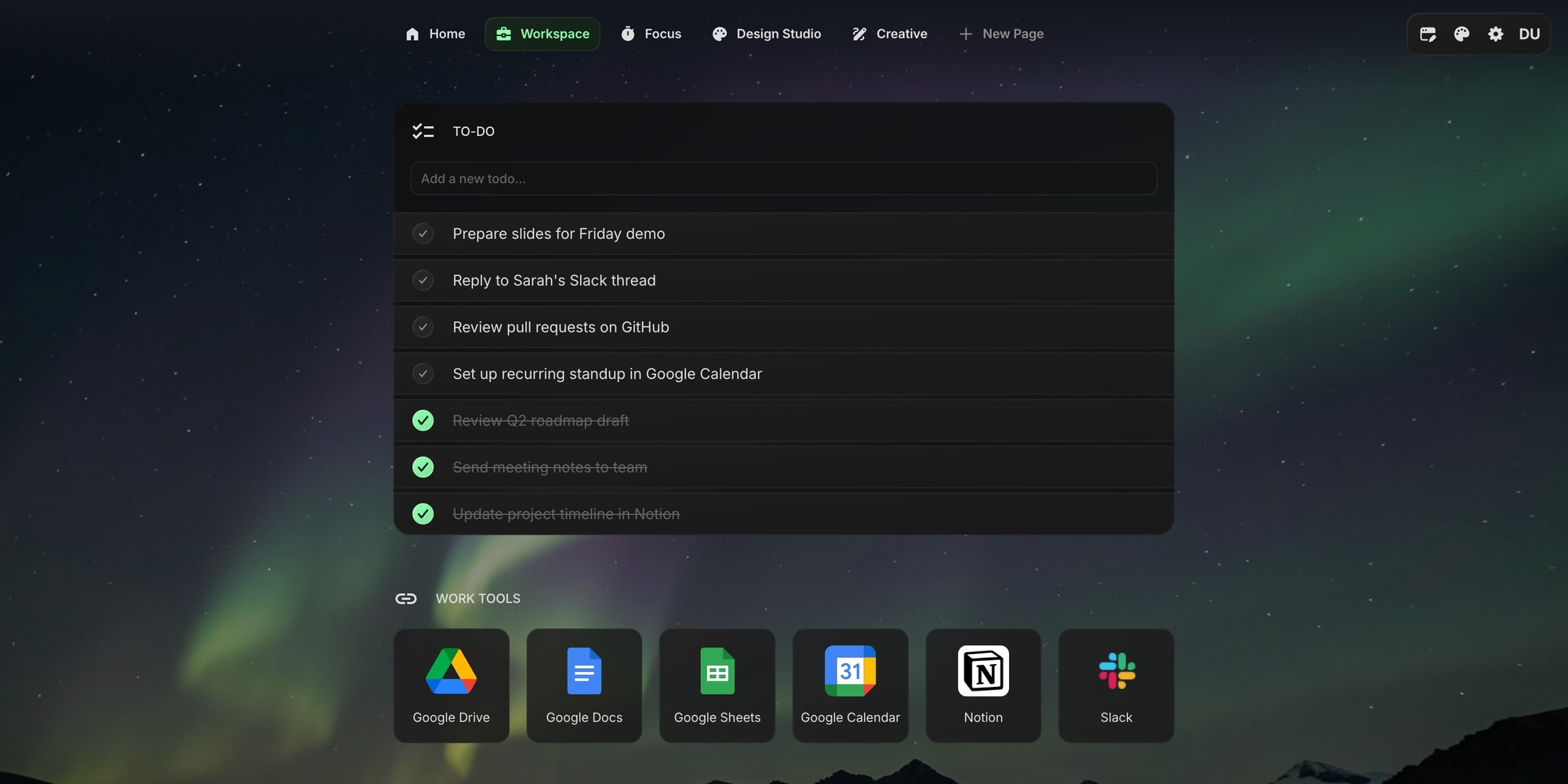
Even the fade behind the sticky navigation bar is tinted with a color sampled from the top of each wallpaper, so the bar melts into the image instead of fading out of flat black. There is nothing to configure for any of this - turn a wallpaper on and the whole dashboard adjusts.
#Light Mode Gets the Same Treatment
Wallpapers were built for all three color schemes, not just dark. In Light, the scrim over the image becomes a white veil and the frosted panels go pale, so a bright photo stays bright and the page still reads cleanly. In Dim and Dark it works the other way around, dimming the image just enough to keep your content on top of it.
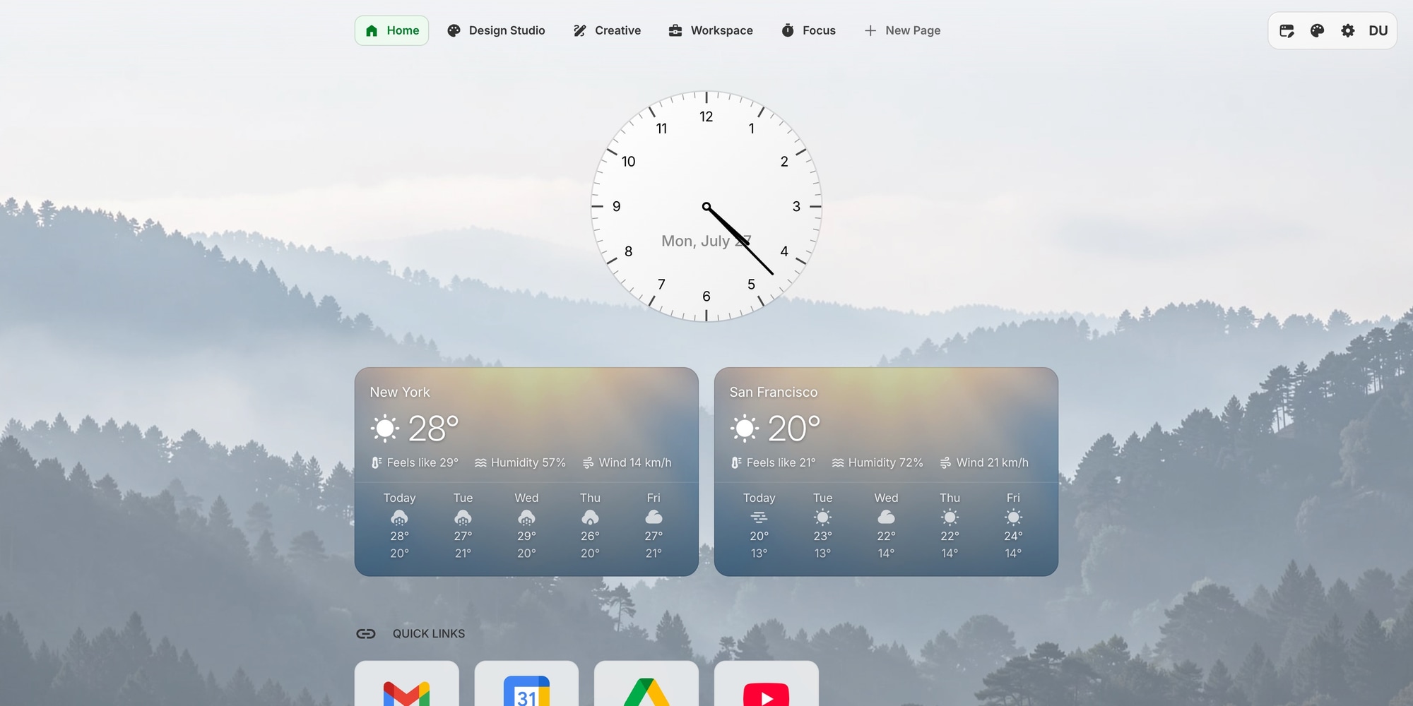
The Rich widget styles that shipped last week hold up here too: Rich weather cards keep their own atmospheric artwork and simply float over the wallpaper, and the watchface dials follow your color scheme as usual.
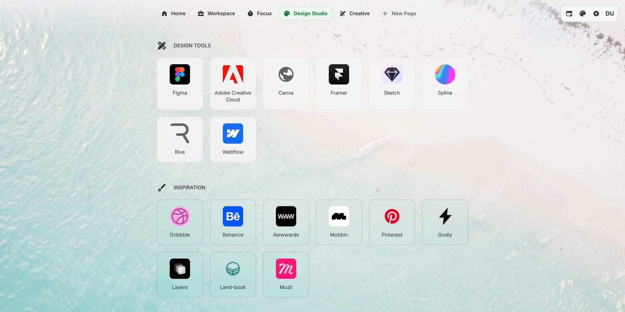
Same page, different wallpaper, and the whole thing changes character:
#Or Upload Your Own
The last tile in the grid is yours. Select it, then click Upload Image - or drag an image straight onto that button - to use any photo you like. Your own shot, a client's palette, a project reference, a screenshot from a game.
The image is resized and stored on your account, and Replace Image swaps it later. Your custom image is remembered even if you switch to a built-in wallpaper for a while and come back.
#It Follows You Everywhere
Your wallpaper is part of your account settings, so it syncs like everything else on your dashboard. Set it in Chrome and it is there when you open a new tab in Firefox, Safari, or Edge, and on startpagehq.com when you sign in from another machine. No re-uploading, no per-browser setup.
That is something the built-in new tab pages cannot do. A Chrome theme stays in Chrome; a Start Page HQ wallpaper travels with your account.
#How to Turn It On
- Click the palette icon in the top navigation bar.
- Switch Wallpaper on.
- Pick one of the 29 thumbnails, or select the last tile and upload your own image.
That is it. The full details are in the appearance documentation, and if you are still putting your page together, our guide to turning your new tab into a dashboard is a good place to start - set the wallpaper last, once the widgets are where you want them.
Wallpapers are live now. Open your dashboard to pick one, or start for free if you do not have an account yet.